Elwira Pawlikowska: Architecting the Realm One Brushstroke at a Time
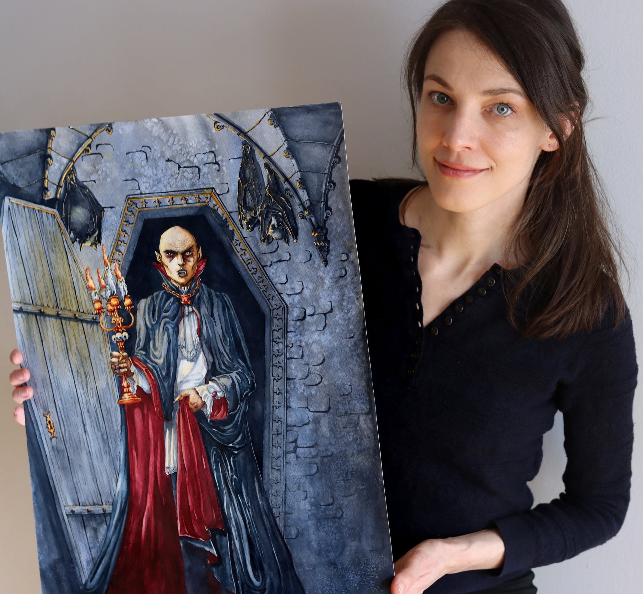
Elwira Pawlikowska holds up her painting Nosferatu, a Unique Undead and ageless aristocrat.
Long before she painted the sprawling, glass-towered cities of Sorcery: Contested Realm, Elwira Pawlikowska was a high schooler in Poland trying to convince her parents that drawing castles and the undead was a viable career path. Her obsession began between the pages of tabletop roleplaying handbooks, where she was first exposed to rich illustrations of knights and enchanted landscapes.
“I looked at these books and thought, 'Wow, that's actually something I could do for a living — that type of illustration!'”, she reminisces.
Today, Pawlikowska lives in Stockholm and has published a staggering 60 paintings across Sorcery’s three sets, with more to come in the new release to be revealed at the end of 2026.
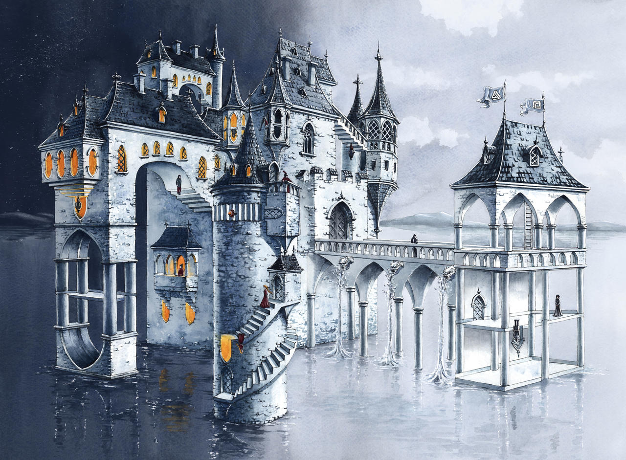
Finding Balance in Creative Freedom
Pawlikowska was first drawn to fantasy art because of the freedom it provides in creating things. Yet, the craft still requires those creations to be grounded in some realism and need to be believable. “It gives me a good balance between imagination and structure.”
But her parents weren’t "too thrilled” about her new-found ambitions of becoming an illustrator for a living. They suggested something a bit more engineering orientated. As a compromise, Pawlikowska decided to pursue an academic career in architecture.
"I thought, 'Okay, my parents will be happy for a while at least, and I will be able to develop my artistic skills anyway.'"
The drive to find balance between artistic freedom and structure through architecture is heavily influenced by Pawlikowska's favourite artist growing up.
Fellow Polish painter and photographer Zdzisław Beksiński is renowned for his epic dystopian scenery. He is a leading figure in contemporary Polish art, peaking with his fantastical realism work in the 1980s. One of the things that made him unique was the fact that he used his education in architecture and experience in construction work as inspiration and reference for his art. Some of his most renowned pieces (which are deliberately untitled) depict grand, derelict structures and are painted with hyper-realistic realism.
Pawlikowska emphasises that while her career path was inspired by Beksiński, her art style is clearly very different. Her medium of choice is watercolours. It’s a skill she picked up during her studies in architecture and adds to her style.
She points to artists like Alan Lee and John Howe as big inspirations. Both were instrumental in defining the visual look of J.R.R. Tolkien’s Middle-earth in the books and Peter Jackson’s film trilogies. Their focus on lived-in realism and vast, imposing landscapes was achieved through detailed pencil work and muted watercolouring.
“I saw their artworks and I knew that I can develop my skills and also paint detailed fantasy artworks with watercolours.”
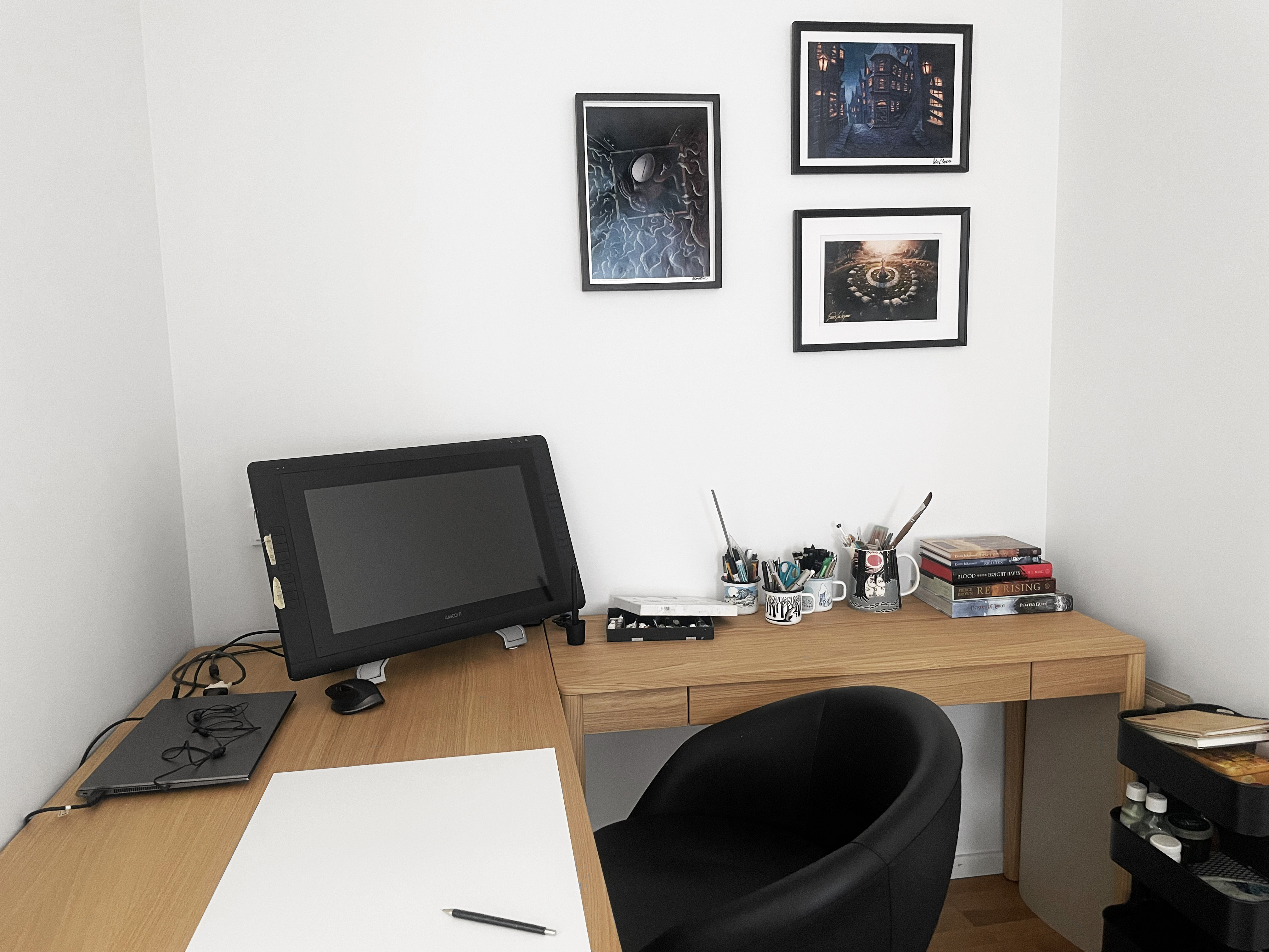
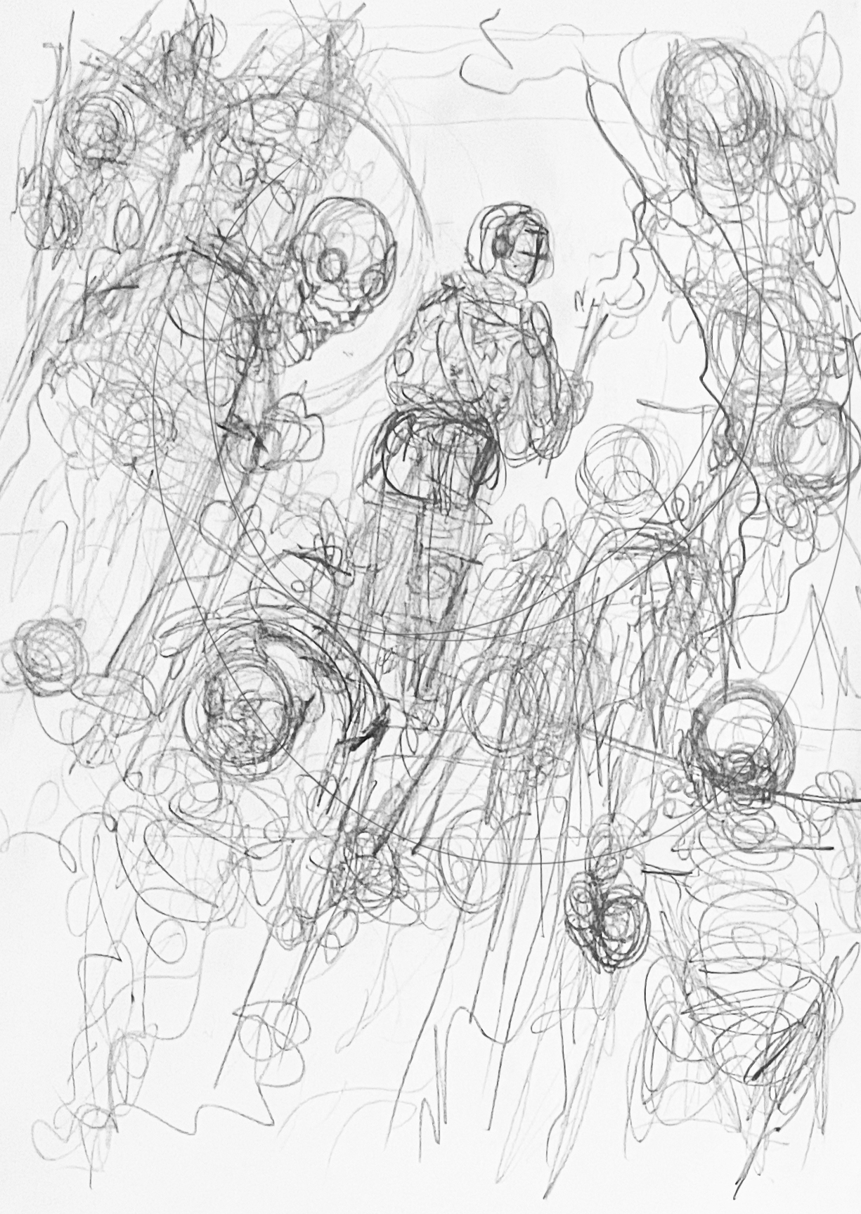
Before she picks up the paintbrush, Pawlikowska starts out with a series of chaotic concept sketches, using the first page she can get her hands on, whether that's the back of a bill or letter from the bank. She explains that most of her structural designs come from memory, which is a useful skill picked up studying architecture.
"I don't need so many references when I create architectural illustrations. It's mostly my knowledge mixed with my imagination."
“Then I create a very detailed, full-scale pencil drawing on the paper that will be painted. All the details are there at this stage.”
It is only at this point that she proceeds with her watercolours, methodically brushing atmospheric hues over the precise pencil work. “Since those [watercolours] are semi-transparent paints, you don't have much room for fixing something if it goes wrong,” she cautions. When everything is painted, she finally enhances the linework with waterproof ink pens.
Her technique is rooted in precise architectural drafting and meticulous watercoloring, but the mood of her paintings draws from a different era entirely. The paintings are typically washed with a palette that employs grey, tan and deep navy blues, and many of her illustrations are monochromatic. Pawlikowska points to 19th-century Romanticism as a major influence, specifically the mysterious, atmospheric ruins painted by Caspar David Friedrich.
The paintings published by Sorcery especially carry a dark, nostalgic atmosphere, but she is quick to clarify with a laugh that it doesn't stem from personal angst. "I don't have any childhood traumas or anything like that. It's really hard to explain. It [the dark atmosphere] just adds mystery and some type of elegance."
Architect of the Realm
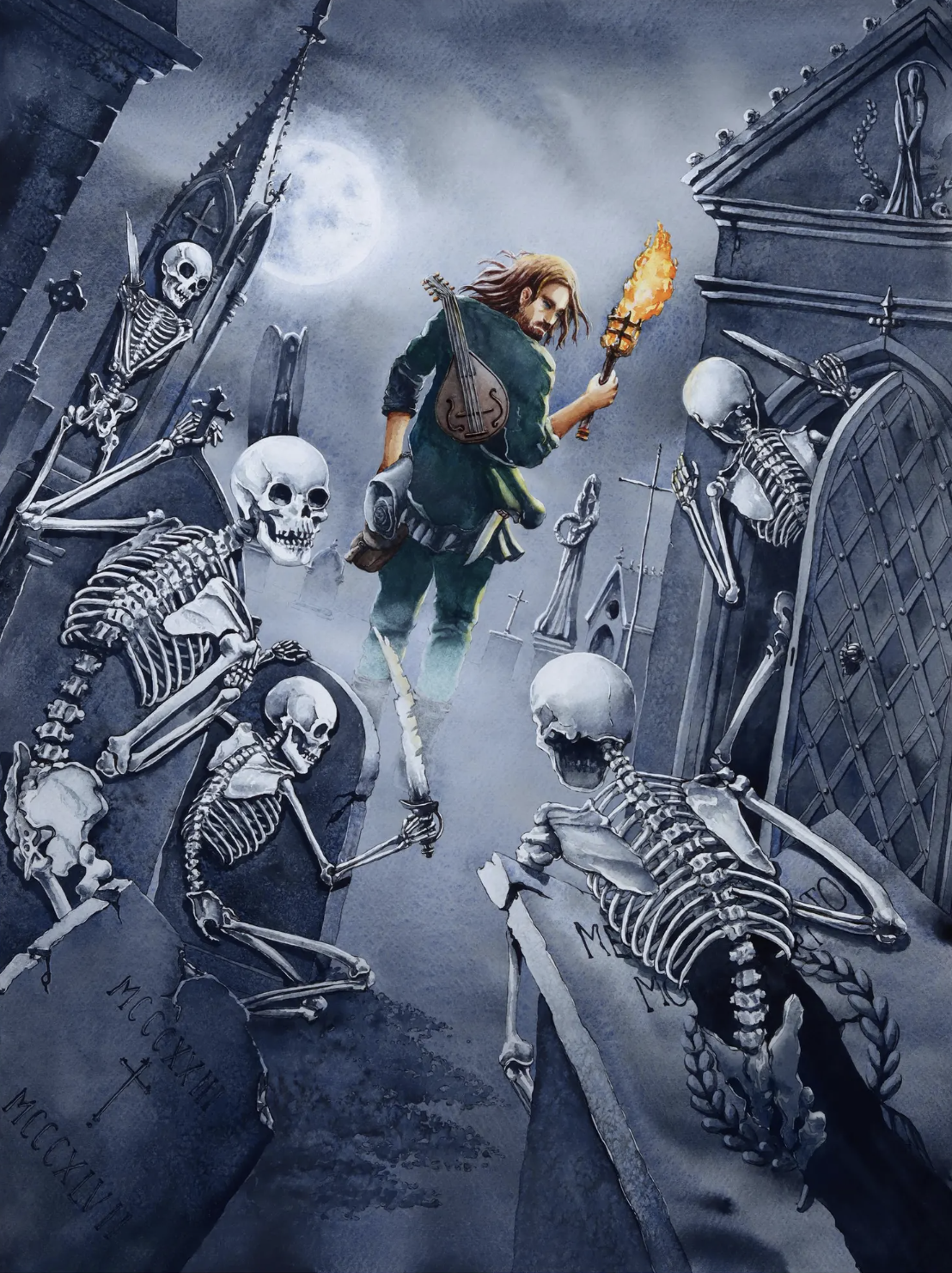
Her distinct style can be found throughout all the Sorcery sets. She also does work for the book publisher Penguin Random House, with her illustrations used to bring the world of Red Rising to life. Beyond those, some of her other work includes a series of illustrations for Swedish children's books called Den Gamla Kyrkogården (The Old Graveyard).
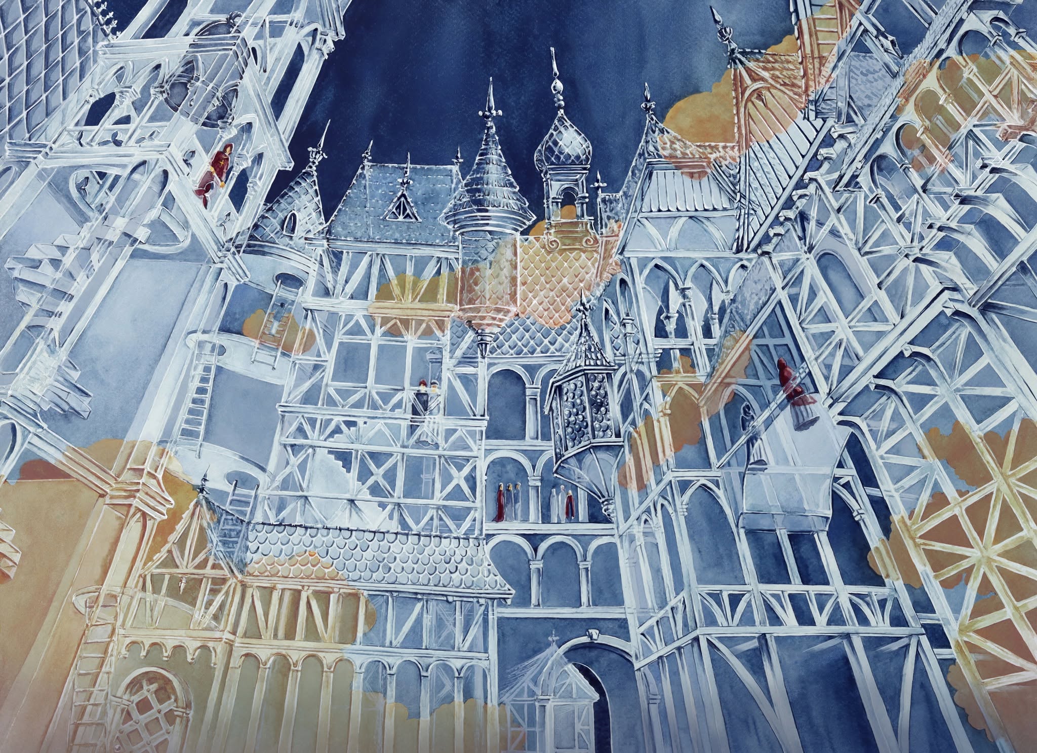
Pawlikowska showcases her skills in creating detailed realism and perspective drawing in pieces like City of Glass. Drawn from the view of someone looking up from below, the illustration is filled with transparent towers, bridges, and stairways. Orange clouds pass through the background as robed figures seemingly float through the corridors overhead.
But often times, her nod to her structural design talents is much more subtle. In Granary Rats, for example, a clan of rodents are devastating stalks of grain. One rat uses the other’s face as a step stool to get to the goods. Their white fur is contrasted by their pink feet, ears and snouts. In the background, there's a misty scene of washed grey and a traditional 19th century Scandinavian granary. Pawlikowska had to research these mischiefs for reference. But the granary was mostly from memory.
Another painting that demonstrates her unique style is Infiltrate. A masked woman in an extravagant red dress hides a dagger behind her back as she enters a grand hall to join a banquet. The character dominates the foreground, but Pawlikowska’s attention to the interior design is what really pulls the viewer into the scene. The tall windows and dome ceiling is reminiscent of a 19th century European ballroom, but with a gothic touch.
Hidden Worlds in Plain Sight
To tie her expanding universe together, Pawlikowska frequently adds hidden references and visual callbacks to her own portfolio into her environments. The highly detailed Town is an island home where towers and walls guard red-thatched homes which are also found in Annual Fair.
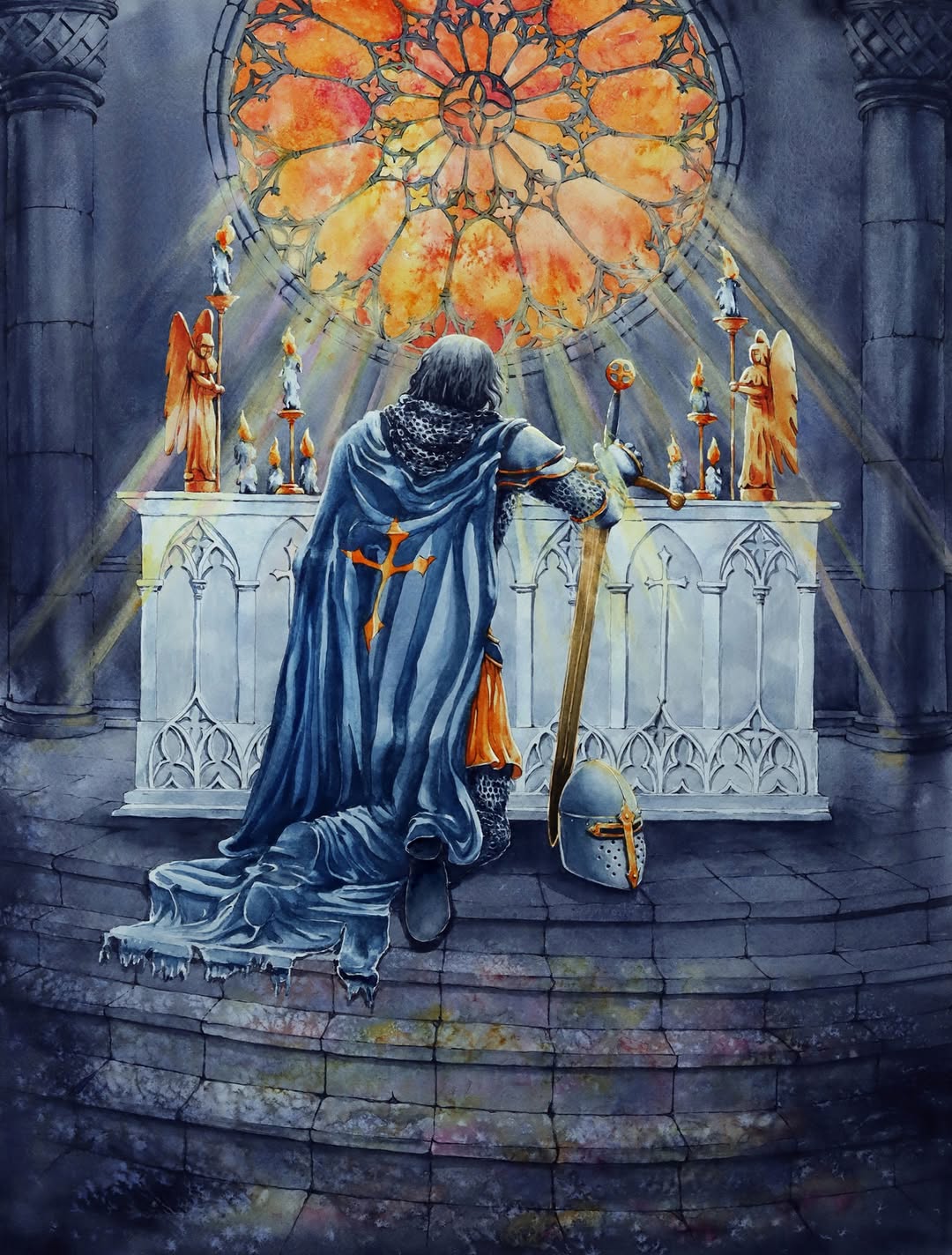
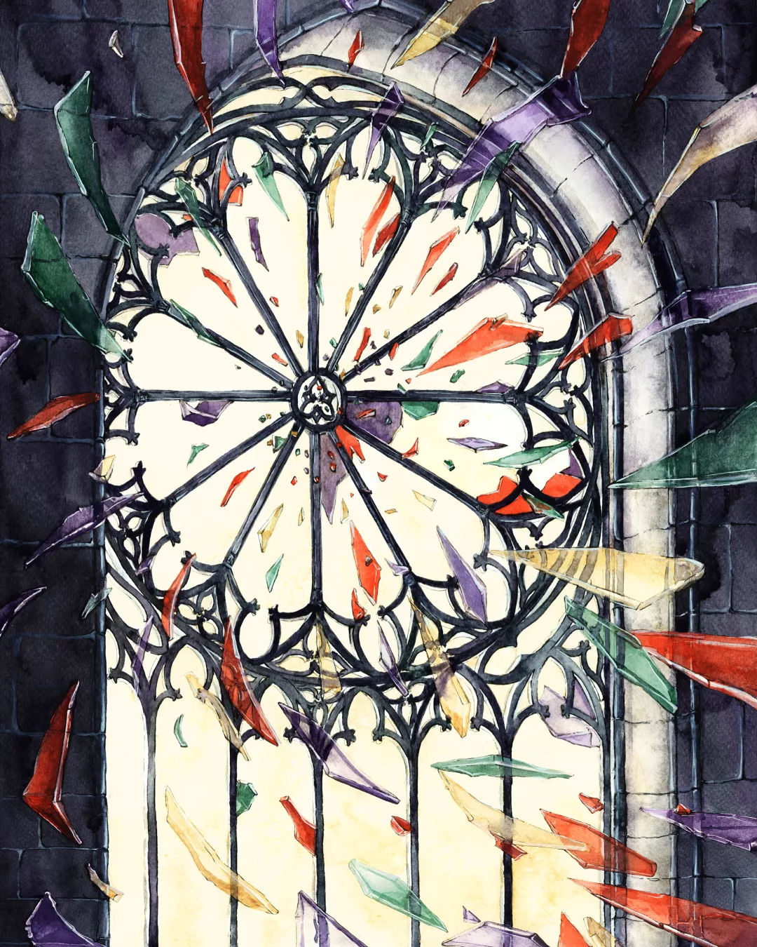
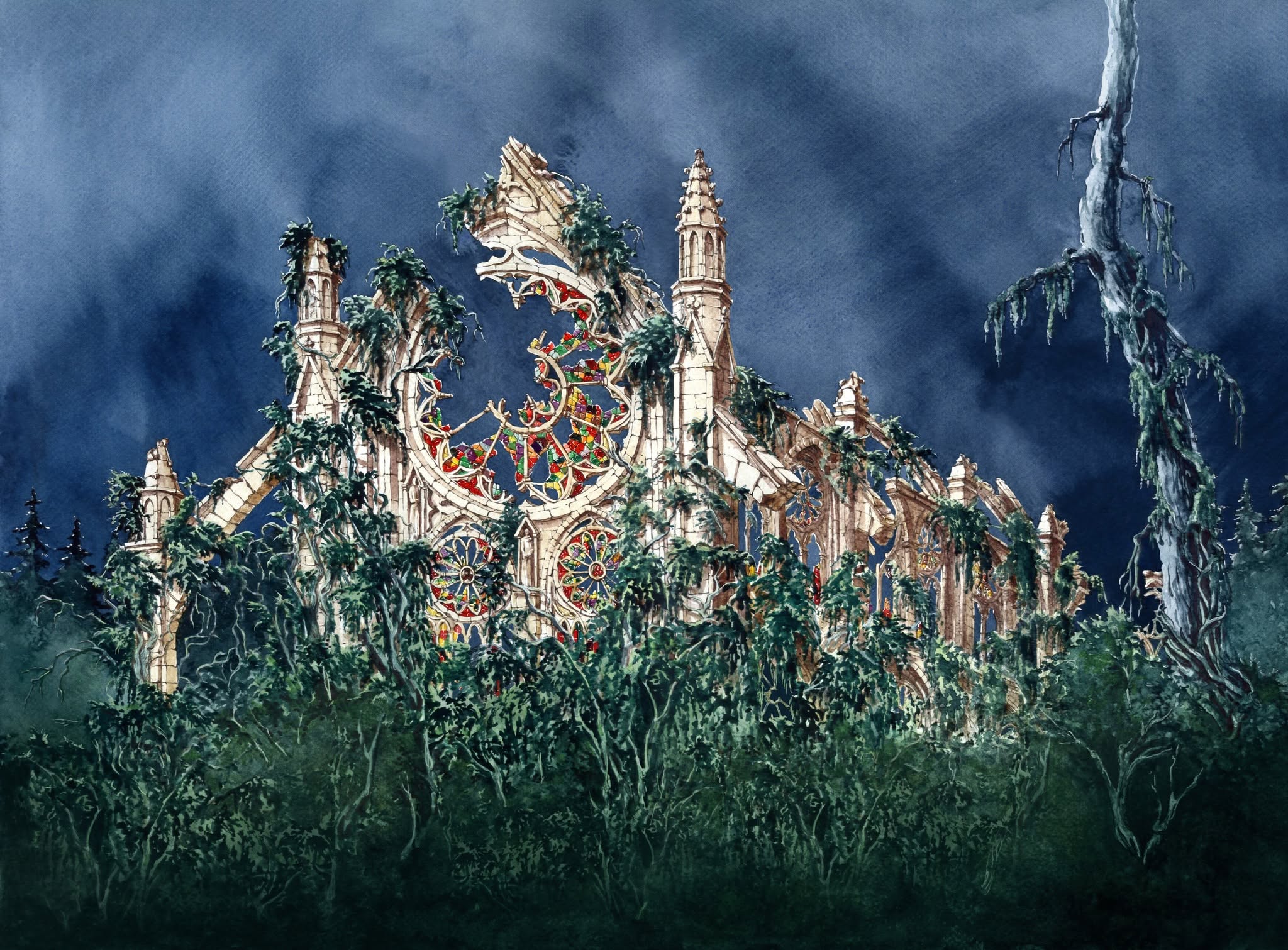
Holy Warrior is an iconic illustration from the latest Gothic set. It shows an armor-clad figure kneeling at the altar. Light pours through a magnificent stained-glass window. But in Disenchant, that same window bursts into vibrant shards of red, green and purple. The tale concludes in her rendition of Rubble. That once-holy structure has finally become a “forsaken site”, and those familiar window frames are ultimately overgrown with vines decades after that moment of faithless destruction and the knight's solemn prayer.
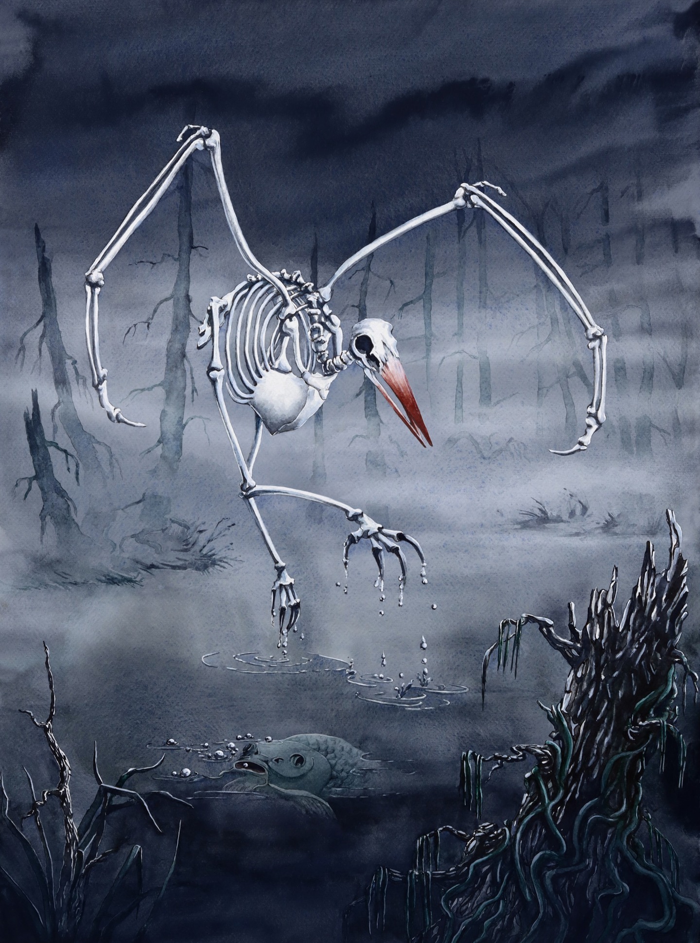
She is also fond of adding easter eggs. In the card Fowl Bones, a skeletal bird hunts for its prey, somehow staying in flight without its feathered wings. Pawlikowska painted a “slightly silly-looking” fish in the dark, swampy waters. However, on standard printings, the little critter is entirely obscured by the card's text box. The only way to actually see the sea creature is on the full-art foil version of the card.
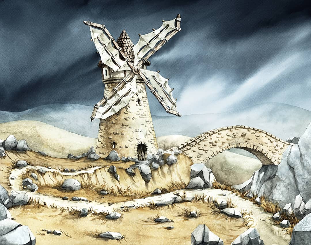
Naturally, Pawlikowska is deeply attached to one of the very first paintings she ever delivered for Sorcery. Washed-out tones bring a beige Windmill to life. It sits in the foreground accompanied by a stone bridge with colours of the same palette. In the background, threatening black clouds loom. The card’s flavour text reads:
“The wind’s wild words, in uncertain surges, whisper how the world was made.”
It is a fitting and somewhat haunting sentiment for an artist who builds entire worlds from the ground up.
Asked whether she ever gets emotional when having to part with her physical paintings when they get sold, she is quick to point out that it creates the exact opposite feeling. "For me, it's such a huge compliment when someone actually values my artworks that much and frames the painting to give it some special spot in their home," she says. "That's actually a huge, huge joy."
Sign up to the Haystack Newsletter.
Keep reading
A year in a drawer
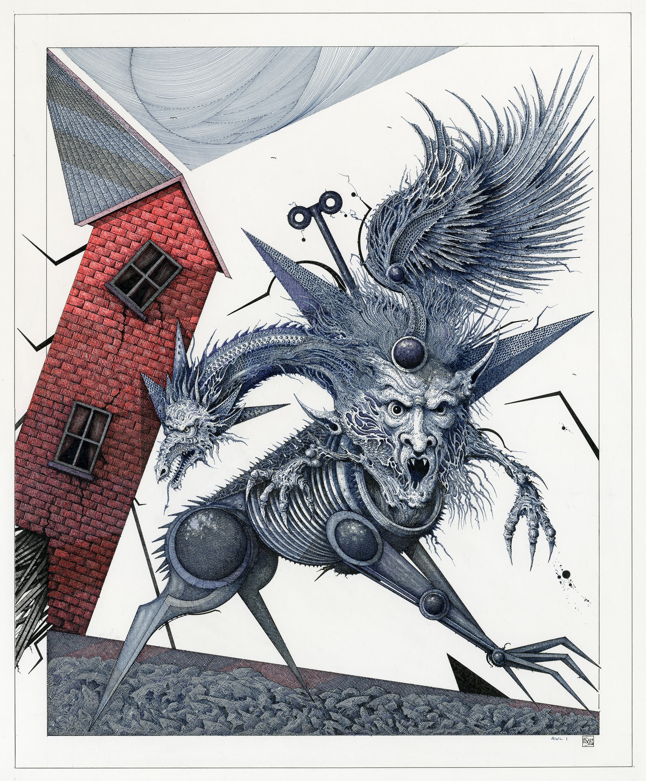
Ian Miller couldn't finish a dragon, so he put its head in a drawer for a year. Awl 1 is what came out.
Drew Tucker on Folklore, Family, and the Living Canvas
Drew Tucker builds his fantasy art directly out of his own life. From 1990s scanner constraints to family folklore and sympathetic magic, Tucker reflects on three decades of letting the paint have a voice.